Okay so before we continue any further, we had better clear up exactly what candlesticks are and how you should interpret them.
They may only seem like a small insignificant red and green lines on a chart, but each one of them tells a whole story that we should be paying attention too. So what exactly is a candlestick?
To put it simply, candlesticks are a type of chart that we use to easily display the high, low, open and close of a particular time period.
Whatever time frame the chart is that you’re trading, that signifies the length of time it takes to form each candle. For example, If you are looking at five minute chart, then each candle represents five minutes.
You will sometimes see these referred to as Japanese candlesticks, which is where the idea originated from back in the 1700’s. They were originally created so that the Japanese people could monitor the fluctuations in the prices of rice.
It is only in relatively recent history that these have come back and become synonymous with trading the global markets.
Anatomy of a candle
Each candle can be broken down into several smaller parts, each one giving us some valuable information as to what the price did during that particular period of time.
Here is an image of a labeled candlestick.
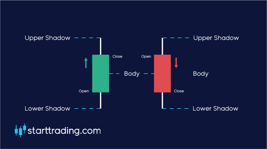
Open
Every candle must start somewhere, this is what we call the open. The open is located where the close was of the previous candle and signifies the starting point of this candle’s given period of time.
Close
This is the exact point at which the candle closed when the set period of time expired.
Body
The body is the area between the open and the open and close points on the candle. This is also referred to as the “real body” of the candle.
- If the close is above the open, that means that the price moved up during the candle formation. This will typically form a white or a green candle.
- If the close is below the open, that means that the price moved down during the candle formation. This will typically form a black or a red candle.
Wicks and shadows
As you can see from the image, there are two lines either side of each candlestick. This signifies the high and low of each candle, or the upper and lower shadows.
This simply displays the high point/low point that the price got to during the candlestick formation.
Bullish
Using the information that we gain by looking at each candlestick we can come to some assumptions about the market sentiment.
There are many ways in which we can do this, but one of the easiest to spot is by looking at the length of the body of the candle and it’s colour.
At its most basic, a green(white) candle is considered to be bullish one, after all, the price has moved up.
If it has a long green body, then we consider this to be a STRONG bullish candle. If it only has a small body then we could consider it to be a WEAK bullish candle – simple stuff.
These bullish candles show us that there were more buyers than sellers during this time period and it also shows us the strength of this buying power. The stronger it is, the larger the candle body.
Bearish
On the other hand, a bearish candle demonstrates when the bears have a hold of the market and are pushing the price down.
If a candle has a red(black) body then it is considered to be a bearish candle. The price is going down.
Again, If the candle has a long body then we would consider this to be a STRONG bearish candle. If the candle only has a short body then we would consider this to be a WEAK bearish candle.
The longer the candle, the more bearish the market is and the more the sellers have overpowered the buyers.
Bullish & bearish (Shadows & wicks)
Similarly to the real bodies of the candles, the shadows and wicks can tell us a lot about how bullish or bearish the market is.
For example, if there is a large wick on the upside this is usually an extremely bearish sign and is what we would typically call a price rejection.
The shadow indicates that the price pushed up to that point but was quickly pushed back down, hence the term rejection.
The same is also true for the opposite scenario. If you find a candle with a large wick to the downside side then this is a downward price rejection and is usually a bullish sign.
The longer the wick, the stronger the rejection is.