Now that we have got the basics of the moving averages and relative strength index covered, we can move on to something a little more complex, the MACD.
MACD stands for Moving Average Convergence Divergence and it is a trend-following momentum indicator. Sounds fancy right?

At first sight, the MACD can look a little confusing and potentially intimidating to new traders but don’t worry, it doesn’t have to be.
Let’s break it down:
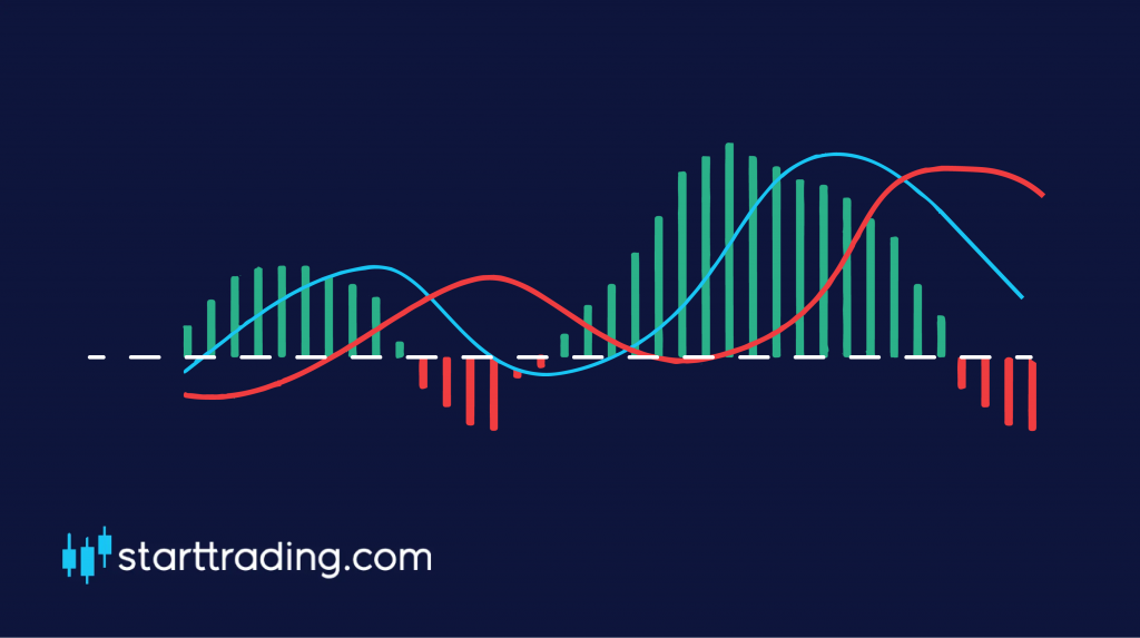
The horizontal line in the middle is the “zero” line and acts as our base point.
The next line to get plotted is the “MACD” line which used the 12-day and 26-day EMA. It is calculated by subtracting the 26-day EMA from the 12-day EMA. This is the red line in the image.
The next line that is drawn on the MACD is the “signal” line which is simply a 9-day moving average of the MACD line. This is the blue line in the image.
The red and green bars that you can see on the chat are what is called the “histogram”. This simply indicates how far away the two lines on the MACD are from crossing over with each other. As you can see, the closer they get to crossing, the closer the histogram gets to the horizontal “zero” line.
Bullish or bearish
To put it simply, the market is considered to be bullish when the MACD and signal lines are located above the zero line and it is considered to be bearish when they are both found to be below the zero line. Simple stuff.
So how do we trade with the MACD?
Trading with the MACD is simple. We simply wait for a crossover to occur between the two lines on the chart and then enter our positions accordingly.
If there is a crossover below the zero line then this indicates a change in momentum and is a signal for us to BUY and open up a long position.
If there is a crossover above the zero line, then we would consider this to be a SELL signal as the trend may be reversing as the buyers are “running out of steam”.