Relative Strengthen Index

The relative strength index, or more commonly referred to as RSI is another momentum indicator that we use in technical analysis that measures the strength in the recent changes of price.

It is an extremely popular tool, you will have likely come across other traders using this tool and often you can find traders having this as one of their only indicators.

It is relatively simple to comprehend and it gives some fairly simple signals to follow when incorporating it into your trading arsenal.

What is RSI? 

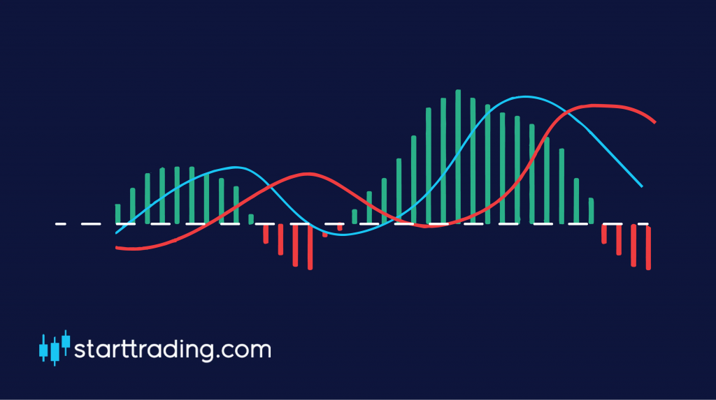
The RSI is depicted as an oscillator on our trading chart and has a value from 0 – 100 and will look something like this on your chart.

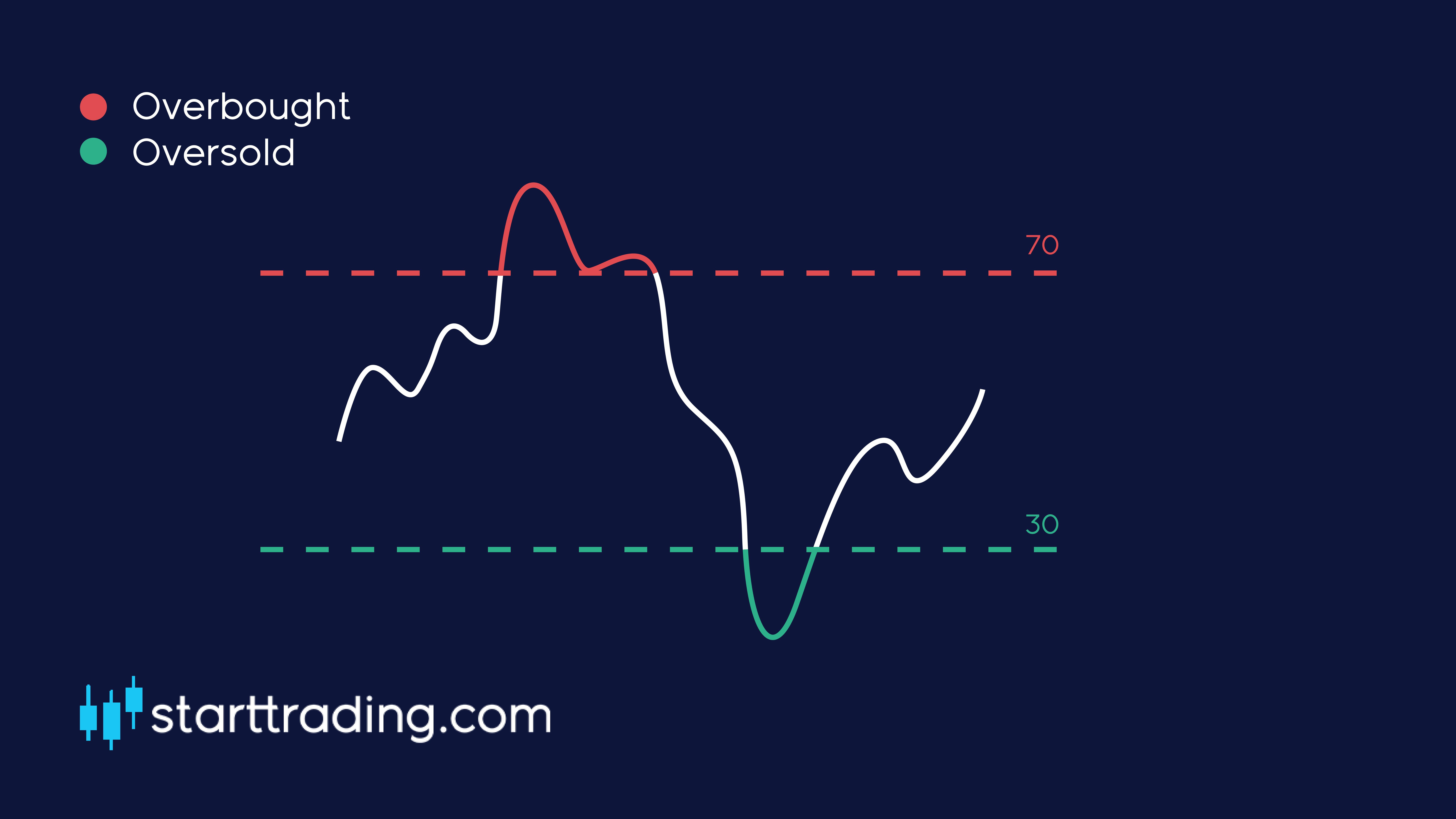
The blue line that you can see on the indicator represents the RSI and what level the market is currently trading at.

The RSI will rise when the number and the size of positive closes increases, and it will fall as the number and the size of negative closes increase. As mentioned, the RSI can only fall somewhere between 0-100, however, there are two very important levels to keep an eye on when it comes to picking up trading signals.

Oversold

As you can see from the graphic above, we have two dotted lines displaying “oversold” and “overbought”.

Typically, when the RSI falls to 30 or below, the market is considered to be oversold. The more oversold the market becomes, the higher the likelihood that the market will rebound and the price will strengthen.

Overbought

The opposite is true for when the market is starting to run out of steam. When the RSI rises above 70, this is considered to be in overbought conditions and the market will be more likely to fall back down.

The higher the RSI goes, the more likely the market will lose strength. What goes up most come down at some point.
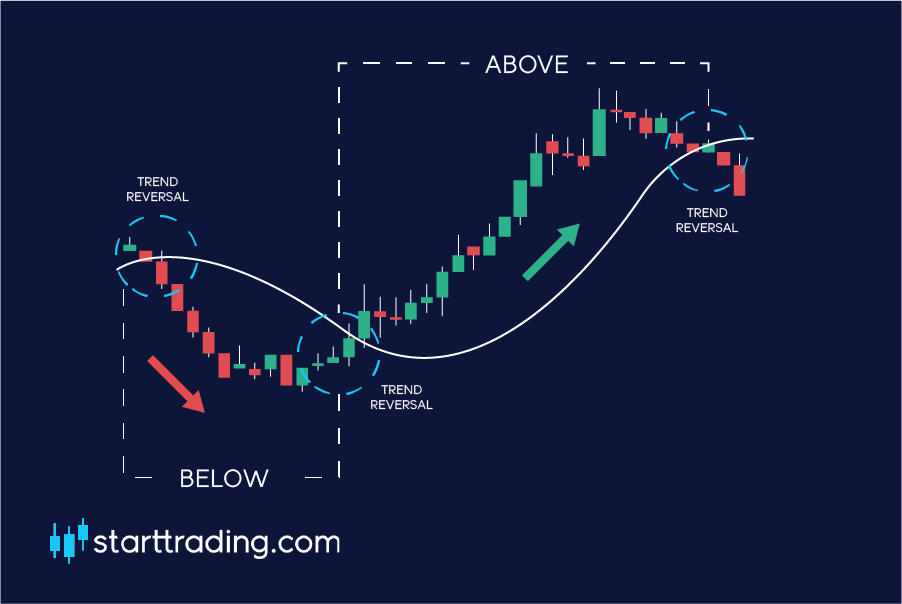
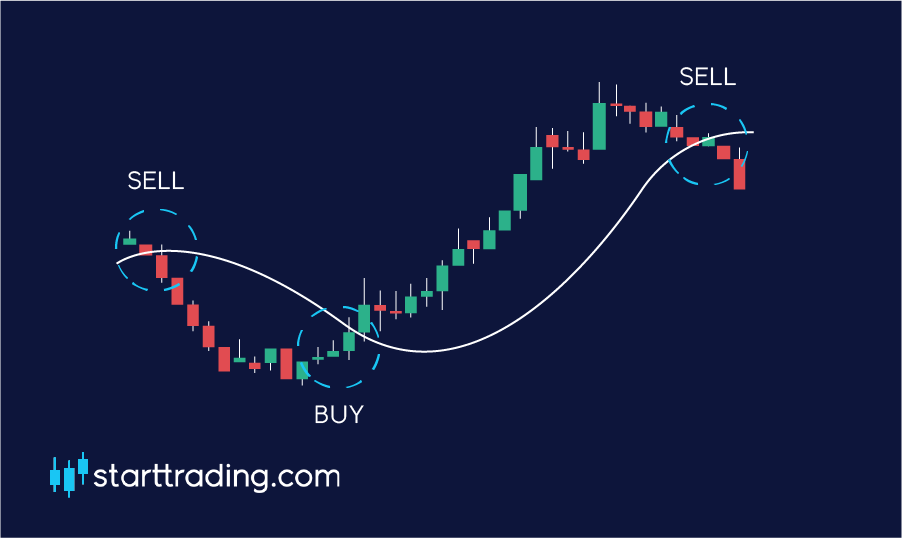
Trading signals

RSI is a great tool for recognising when market reversals may be ready to happen. If the market reaches overbought or oversold conditions you should look for other indicators to give you confluent reasons to enter a position.

For example, if you see that the market is about to hit a support at the same time that the RSI hits 30 and is now oversold, that would be a great time to open up a long position.

Double bottom & double top

Okay, now it is time to start looking at some patterns that we can see on our charts. Double top and double bottom patterns appear on our charts when the price action of the currency pair moves in a similar way to the letter “W” or “M”.

The letter “W” represents a double bottom as it shows the price rebounding off of the same price point twice. This indicates a bullish trend reversal.

The letter “M” represents a double top as it shows the price rebounding off of the same price point twice. This indicates a bearish trend reversal.

These are very important technical analysis patterns that we can use as traders to try and predict where the price will move in the future.

Double top

Here is a diagram of a double top. As you can see, the market is in a bullish/uptrend and moves on to create a new high (shown as peak 1 in the diagram). The price then falls down before bouncing back up again to create another high (shown as peak 2).

When the price falls after reaching peak 1, the area that it reaches is referred to as the “neckline”. This is a vital price point that we will come to in just a moment.

For this to qualify as a double top, peak 2 must not exceed the heights of peak1. The bullish trend must try to break new heights but fail and then fall back down to the necklines.

So how do we trade based on this information? During a double top, we would enter a sell/short position when we see the price break the neckline after the second top. The breaking of the neckline confirms the double top and usually signals a bearish trend reversal that we can capitalise on.

As you can see from this example, we have two clear peaks and then a clear break through the neckline following the second peak. This would be our entry point for a sell.

Double bottom

No points for guessing what a double bottom is. Yep, it’s the mirror image of a double top.

Here is an example of a double bottom. As you can see, we had the first bottom followed by a rebound up to the neckline followed by another rebound to the second bottom.

We should enter a long position when we see that the neckline has been successfully broken.

Tip: Double tops and double bottoms can be extremely profitable if we can successfully identify them. However, if you misidentify one then it can be very costly.

Make sure you set a tight stop loss and manage your positions carefully. It may be beneficial to paper trade these patterns for a while before live trading them so that you can practice spotting them without putting your trading capital at risk.

Triple bottom & triple top

Similar to the double top and double bottom patterns, the triple top/bottom works in a very similar way.

It is a pattern that we use in order to identify trend reversals during market uptrends/ downtrends. If we spot them during an uptrend, then this is a very clear signal that the market is about to undergo a bearish reversal.

On the other hand, if we spot them during a market downtrend then this is a clear signal that the market is about to undergo a bullish reversal.

Triple top

A triple top pattern occurs when we see three subsequent peaks at very similar price levels. As the price has tried to break this price level on three separate occasions and has failed, we can safely assume that this is an area of resistance.

Similar to the double top, the area that the price pulls back to is referred to as the neckline. Should this level break after the third peak then we have a clear signal to enter a sell.

A clear and obvious area to set out stop losses would be above the highest peak in the triple top pattern, which is usually the first peak. If the trade was to break that price level the trade has become invalid and the triple top did not form correctly.

As you can see from the image above, the price created three peaks that it failed to break and then eventually broke out of the neckline support after the third peak. This was a clear point for us to enter a SELL position.

Note: We can obtain a clear take profit point when trading this method by looking for the price to retrace at least the same distance between the top of the peak and the neckline. We can use this as a guide to where to expect the price to reach.

Triple bottom

The triple bottom is the exact mirror image of the triple top. Here is an example.

The exact same principles apply to the triple top, so just trade it the exact same way that you would a triple top, except for this time we enter a LONG position upon the break of the neckline.

Head & shoulders

To keep in the theme of the recent lessons, the head and shoulders pattern is another trend reversal pattern that we can use to identify when the market may be about to turn.

This pattern is also similar to the double top/triple top patterns and we trade it in pretty much the same way, with only a few variations. First of all, here is an example of a head and shoulders pattern.

As you can see from the image above, it is very similar to the triple top, however the peaks are of different heights and the neckline is not strictly horizontal.

A head and shoulders pattern is formed first by a peak (the shoulder) followed by a higher peak (the head) followed by another lower peak (the second shoulder).

In this instance, we draw the neckline by connecting the two lowest points that are visible from the pullbacks. More often than not the line will not be straight, but don’t worry this is typical for a head and shoulders pattern.

So how do we trade this? Well, we use the exact same method as the triple top and double top. Simply wait for a clean break of the neckline and then enter our SELL positions. We can expect a pullback to be a similar distance to the difference between the head and the neckline.

Tip: Some traders say that the signal is more accurate when then neckline is a downslope. This would signify that the market is clearly losing strength and the possibility of a clean break of the neckline is more likely.

Inverted head and shoulders

As with most of these patterns, there is always a mirror pattern that works in the exact same way. Here is an example of an inverted head and shoulders pattern.

As you would expect, the inverted head and shoulders pattern only arises in a downtrend and must meet all of the same criteria as the standard head and shoulders pattern.

We simply place a LONG once there is a clear break of the neckline and the trend reversal is confirmed.

Triangle patterns

Last but not least in Unit 4 we have triangle patterns. These are common chart formations that occur relatively frequently, so it is important that you get to grips with them fairly quickly.

Here we will cover the three main types of triangle patterns and show some examples. They are the ascending, descending and symmetrical triangle.

Ascending triangle

An ascending triangle occurs when there is a clear horizontal resistance level followed by a string of higher lows. It should look something similar to this.

As you can see, the price is clearly struggling to break through the resistance but the market is showing strength with continued higher lows signifying an uptrend. Eventually, this will come to a point and the market must decide where it is going from here – a breakout is bound to happen.

In an ascending triangle the price will usually break through the resistance and breakout to the upside. However, that is not always the case. You should be ready for both eventualities.

Wait for a clear break of the pattern and set your stop loss at the point where the breakout becomes invalid again. For example, open a BUY order just above the resistance level and set up a stop loss just below the support level of the ascending triangle.

Descending triangle

Yep, you already guessed it. A descending triangle is the exact opposite of an ascending triangle. You should look for a horizontal support line that has continually held the same level while there is weakening price action showing a series of lower highs.

Here is an example of a descending triangle:

Most of the time, the price will break to the downside. The best way to trade this setup is to set a sell order just below the support and set your stop loss at the point of invalidation, which in this case would be located just above the resistance point of the triangle.

Symmetrical triangle

Last but not least, we have the symmetrical triangle. This pattern is an indication of market consolidation. This means that the market is not trending in any particular direction at the moment and could be prone for a breakout to either side.

These patterns occur when the market is making a series of lower high and higher low, like this:

So how do we trade this? Well as we can be pretty sure that a breakout is coming in one direction it is better to prepare for both eventualities. Set up your long orders just above the triangle resistance line and your sell orders just below the triangle support line.

This ensures that you will catch the breakout in whatever direction it goes in. Remember to set your stop loss at the point of invalidation, which will be at the opposite side of the triangle that you opened your order.

A quick word on indicators and patterns

That about wraps it up for unit 4. It is worth quickly reiterating the importance of using a combination of these trading indicators in order for us to be successful.

If we rely too heavily on one signal then we will certainly be shooting ourselves in the foot as we won’t be trading as optimally as we could.

It is advised to use bottom up analysis while looking for multiple confluent reasons to enter a trade. The more reasons you can find to enter a trade, the better.

This may mean that you miss out on a number of winning trades, however, you will vitally avoid those losing trades that can be so damaging to our trading balance and to our mentality.

“Sometimes the best trades you make are the ones you don’t take”.

MACD

Now that we have got the basics of the moving averages and relative strength index covered, we can move on to something a little more complex, the MACD.

MACD stands for Moving Average Convergence Divergence and it is a trend-following momentum indicator. Sounds fancy right?

At first sight, the MACD can look a little confusing and potentially intimidating to new traders but don’t worry, it doesn’t have to be.

Let’s break it down:

The horizontal line in the middle is the “zero” line and acts as our base point.

The next line to get plotted is the “MACD” line which used the 12-day and 26-day EMA. It is calculated by subtracting the 26-day EMA from the 12-day EMA. This is the red line in the image.

The next line that is drawn on the MACD is the “signal” line which is simply a 9-day moving average of the MACD line. This is the blue line in the image.

The red and green bars that you can see on the chat are what is called the “histogram”. This simply indicates how far away the two lines on the MACD are from crossing over with each other. As you can see, the closer they get to crossing, the closer the histogram gets to the horizontal “zero” line.

Bullish or bearish

To put it simply, the market is considered to be bullish when the MACD and signal lines are located above the zero line and it is considered to be bearish when they are both found to be below the zero line. Simple stuff.

So how do we trade with the MACD?

Trading with the MACD is simple. We simply wait for a crossover to occur between the two lines on the chart and then enter our positions accordingly.

If there is a crossover below the zero line then this indicates a change in momentum and is a signal for us to BUY and open up a long position.

If there is a crossover above the zero line, then we would consider this to be a SELL signal as the trend may be reversing as the buyers are “running out of steam”.

Moving averages

The moving average is one of the most commonly used technical indicators, and for good reason. They are relatively simple concepts to grasp and they give us a simple view of the market trends and the recent price history.

So what is a moving average?

A moving average is simply a line on our chart that signifies the closing price of each candle over a specific period of time.

You will notice that the charts we view can often seem chaotic with wild price fluctuations which make the graphs somewhat hard to read. Moving averages help to make sense of this by creating a smooth line that shows the historical price action.

The main purpose of a moving average is to be able to more easily identify trends and to spot reversals as they are happening.

When the price of the currency pair is shown to be above the moving average, this is considered to be an uptrend.

On the other hand, when the price is shown to be below the moving average, this is considered to be a downtrend.

When the trend line is broken, we would consider this to be a trend reversal.

Note: Moving averages are based on past prices and are known as lagging indicators. This means that the information they are displaying to you has already happened. They can not predict when a trend reversal will happen, they can only confirm it once it has happened.

There are a few different types of moving average that we can use in our trading arsenal. The main two that we will consider in this course are the simple moving average (SMA) and the exponential moving average (EMA). Let’s break each one down in more detail.

Simple moving average

Let’s say that we are using a 5-day SMA for our chart. This means that our moving average line will represent the average closing price of the previous five days.

For example, if the closing price over the last 5 days were $1.63, $1.65, $1.70, $1.67, $1.62 our calculation would look like this:

($1.63 + $1.65 + $1.70 + $1.67 + $1.62) / 5 = $1.65. So in this case, our 5-day SMA would be at $1.65.

The longer the period of time that the SMA covers, the less reactive it is to current price changes and fluctuations in the market.

As each of the price points has equal weighting, the most recent price action effects the market just the same as the last price point the SMA uses in its calculation.

This can be problematic to traders as it means that the SMA is slower to react to rapid price movements that may prove to be important.

Exponential moving average

This is where the exponential moving average (EMA) comes in. The EMA gives more weight to the recent price movements which in turn makes it more reactive to the recent events in the market.

This can be beneficial to a lot of traders as trend reversals can be spotted more quickly as the more reactive EMA will display shifts in sentiment over the SMA.

Due to this, when you look at a chart with both the SMA and EMA visible at the same time, you can see that the EMA is closer to the actual price and is more volatile than its counterpart.

When trading, it is much more important to be able to visualise what is going on right NOW with the price action rather than what was happening in the market previously.

Length of the moving average

The period of time that the moving average covers will make a significant difference to its position on each chart. That’s why most traders utilise multiple MA’s at the same time. Here are some of the most commonly used:

10-20 – Short term trends

50 – Mid  term trends

200 – Long term trends

How to trade with moving averages

Moving averages act a lot like support and resistance lines. As many traders are using them at the same time, they are often met with a reaction when the price nears these points. Keep this in mind when doing your analysis.

Look for a bounce or a breakout of these points and then enter your positions accordingly.

As a rule of thumb, when the price is below the MA it will act as resistance for the price to break through. Conversely, when the price is above the MA it will act as a support.

Because of this, when the price has successfully crossed up and over the moving average line, this would be considered to be a buy signal.

On the flip side, when the price crossed the moving average line to the downside then this would be considered a sell signal.

Top down & bottom up

When we trade the forex markets, we are always looking for the optimal moment to enter our positions. At the end of the day, trading is all about timing. If we mistime our trade then we can miss out on potential profits, or worse, we can take a loss.

The best way to ensure our trades have the best chance of being timed correctly is to conduct top-down or bottom-up analysis.

They are both relatively simple concepts, however, you must make sure that you apply these strategies to the majority of your trades if you wish to have the best chance of success.

Here’s how each one works.

What is top-down analysis?

Top-down analysis is a trading style where you start your analysis from the larger time frames “the top”.

When you are looking for trade setups, you will be looking at the higher time frames, such as the daily or even the weekly. This gives you a very zoomed out view of the market which allows you analyze it on a macro scale.

Once you have found your ideal set up, you must then zoom in and analysis the next time frame down to make sure that the set up is still valid. Picture it like zooming in with a magnifying glass to confirm your initial theory.

As we mentioned in the last unit, the more confluent reasons you have to enter the trade, the more likely it is your trade will be successful.

If you have found a trade set up on the daily chart and it is still valid to enter on the H4 and H1 then you can enter a position with a higher level of confidence.

Benefits

  • Focus on the bigger picture
  • Less noise when compared to the lower time frames
  • Easier to see the key levels
  • The levels on higher time frames are typically more crucial therefore it is vital that we have an understanding of where they are and how they will likely impact the market when they reach these levels.

What is bottom-up

If you haven’t already guessed it, bottom-up analysis is when we start with our eye on the lower time frames and then work our way up from there.

Let’s say you are scanning the 15 minute time frame chart and you find a great trading set up. Maybe the price is just about to hit a huge support that your analysis has highlighted and you are looking to enter a long position.

Would this be enough information alone to enter a trade? The answer is no, it wouldn’t.

In this case, it would be much better to go one-time frame higher to have a look at the 30-minute chart to see if our trade is still valid. It would be better yet and much safer to go even higher and look at the 1HR and 4HR time frames, too.

The reason why we do this is to make sure that the route is clear for our trade. The smaller time frame may be screaming BUY but on the higher time frames, there could be a huge resistance in the way that could seriously impact your trade.

Remember, the trend is your friend. If you are looking to buy then make sure that the trend on the higher time frames is upwards, too. You’ll be making your life a lot easier if you do.

Benefits

  • Much easier to spot setups on lower time frames
  • Helps to avoid overtrading
  • Ensures that your trades aren’t going to run into problem areas that are contradicting your setups
  • It gives you more confidence and will likely see you maintain a much higher win rate.